Find live music in LA on any given night.

Any Given Night is a platform for discovering live music across Los Angeles, navigated by neighborhood rather than by algorithm. I joined as lead product designer and owned the product's UX from secondary research through engineering handoff — then designed and coded the landing experience myself.
The challenge
User need
Los Angeles has one of the densest live-music scenes in the world, and no good way to see it. Finding a show means scrolling Instagram, trusting an algorithm, and hoping the right promoter happened to reach you.
Market need
AGN's founding premise is to break the scene's dependence on social media companies and influencers for event visibility, and put discovery back in the hands of music goers themselves. That required a product where the city itself — not a feed — is the interface.
The approach
How might we let people discover live music the way they actually move through Los Angeles — by neighborhood, on a given night — instead of through an algorithmic feed?
Key insights
Findings from secondary research into how Angelenos actually find shows, and where the existing tools break down.
Discovery is fragmented across Instagram, venue calendars, and word of mouth, with no single source a music goer can rely on.
Geography is how Angelenos decide which show to attend — a cross-town drive is frequently the deciding constraint, not the lineup.
Small and mid-size venues are systematically under-surfaced compared to promoted events, which is precisely the gap the platform exists to close.
Event details live inside poster images rather than structured data, which is why listings are so hard to aggregate at scale.
Process & iterations
Research, structure, identity, and interface — the path from an unmapped problem space to a build-ready product.
Secondary research
I started by mapping the Los Angeles venue landscape and the tools people already use to find shows — venue calendars, ticketing platforms, promoter accounts, and aggregators — to understand where discovery was breaking down before designing anything.
I audited the four platforms Angelenos actually reach for, looking at what each one surfaces, what it leaves out, and how it presents itself — which is where the neighborhood-first gap became obvious.
Dice
- Ticket based — only displays shows using Dice's proprietary ticketing system
- All genres, no obvious curation
- Bold and bright UX with clear CTAs and brand values displayed

Resident Advisor
- Highly curated (electronic / DJ / rave focused)
- Highlights shows using their ticketing system or curated through their editorial system
- Niche, easy to miss if you aren't involved in electronic music scenes
- Dark, minimal UX with tech / SaaS influenced branding
DoLA
- Displays large / commercial venues only, missing niche or DIY venues that could otherwise be highlighted
- Not reliable for neighborhood level curation or browsing
- Corporate branding, minimal, with an overcomplicated UX dashboard
ITK.LA
- Curated shows, updated infrequently
- No visual interface — text based, lacking posters or imagery surrounding shows and artists
- Barebones UX, plain text on white background
Wireframes & user flows
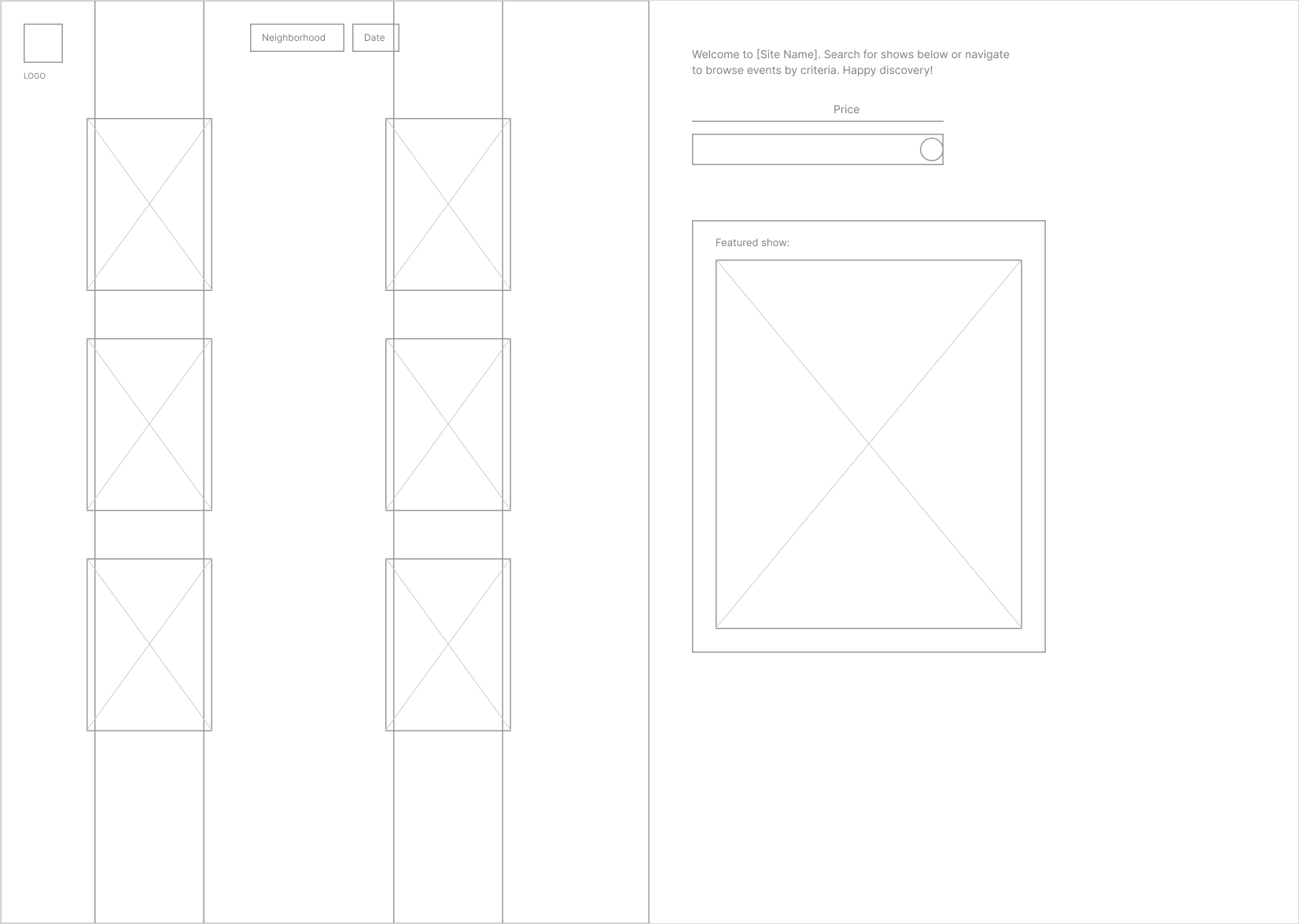
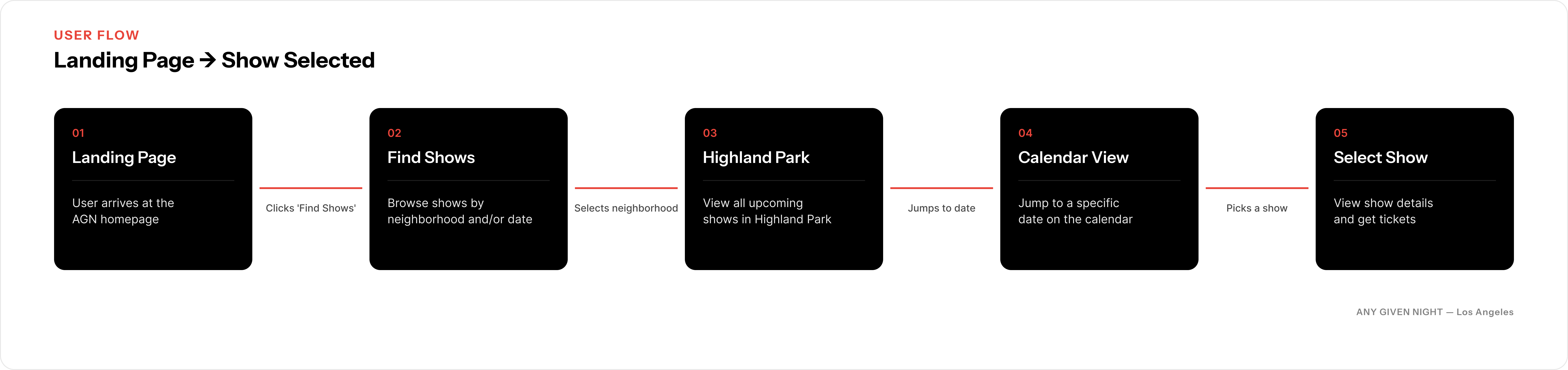
I wireframed the neighborhood-first structure in low fidelity, testing how someone gets from "I want to go out tonight" to a specific show without ever meeting a feed.
Brand & visual identity
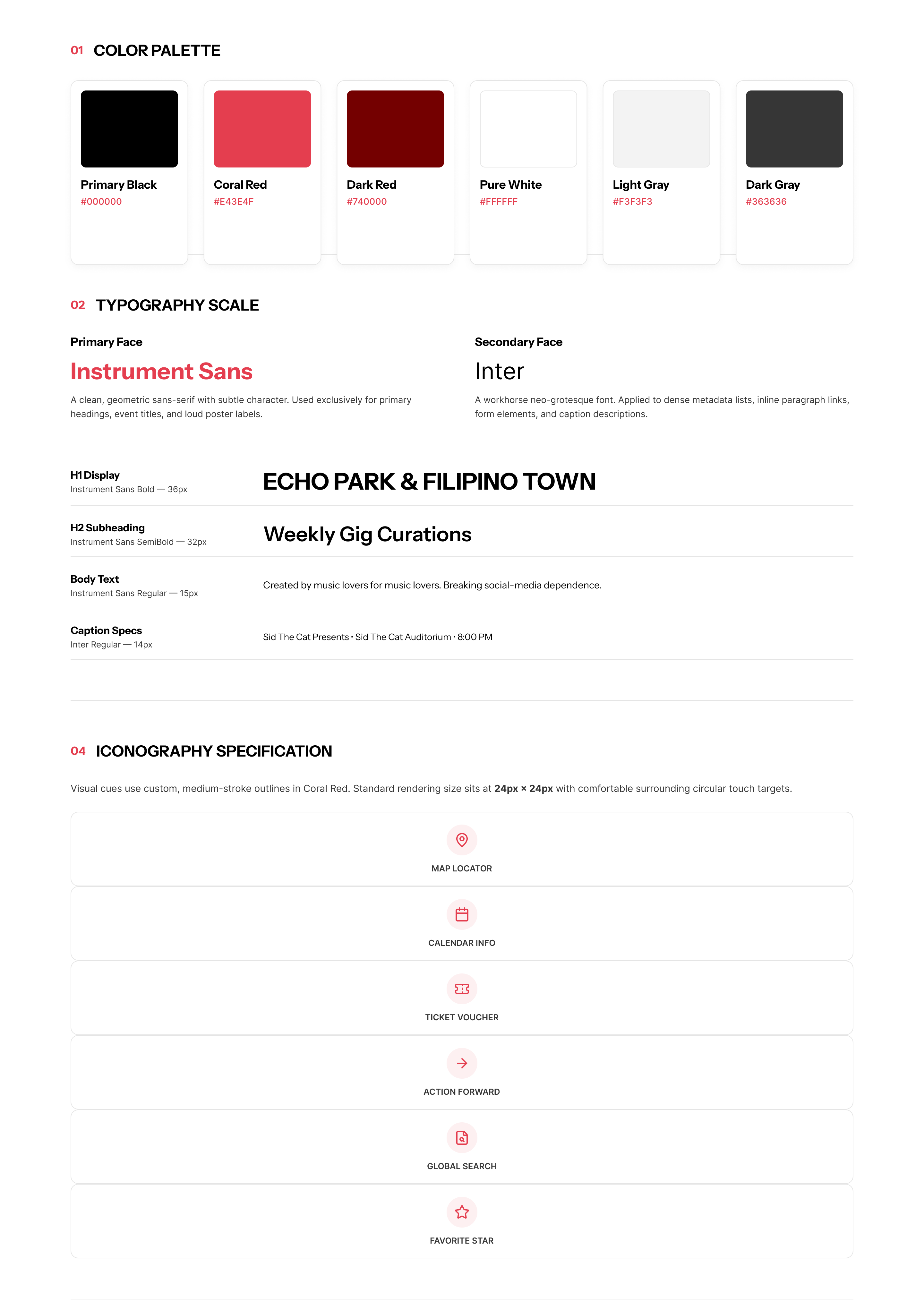
The identity had to feel like a flyer stapled to a telephone pole, not a tech product — high-contrast condensed type, a single red accent against black, and real photography of the neighborhoods themselves rather than stock illustration.

Hi-fi UI & prototype
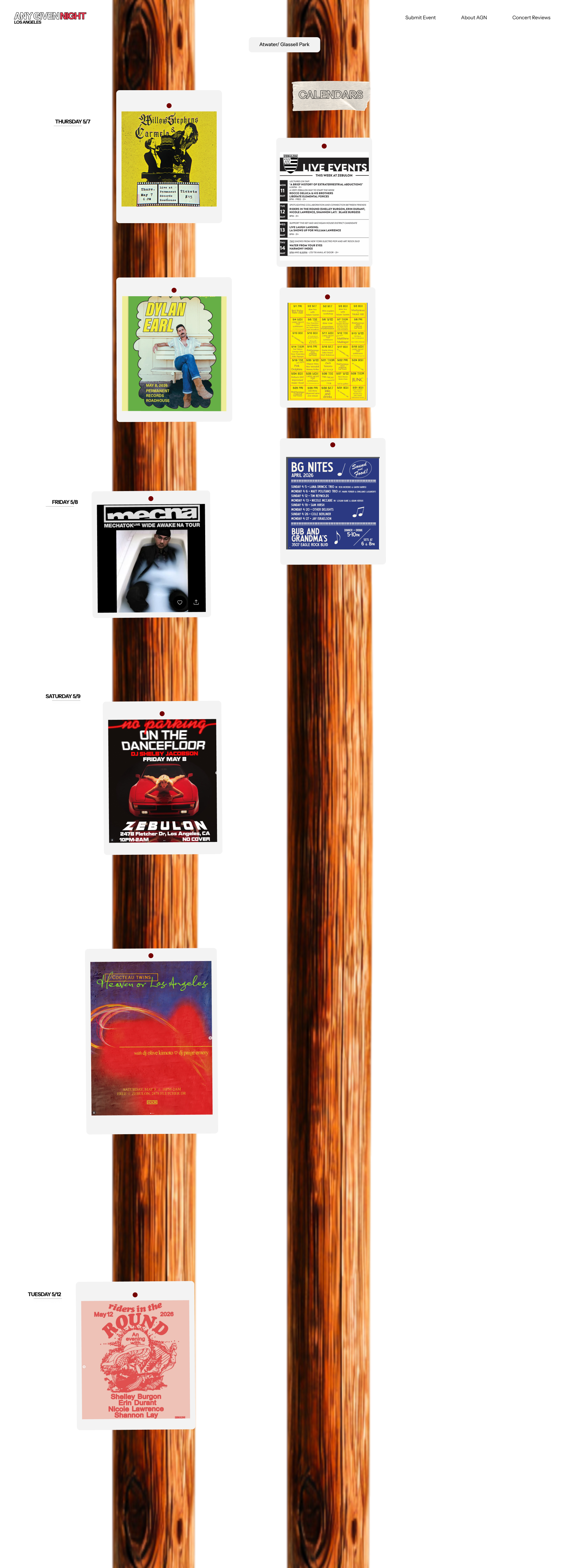
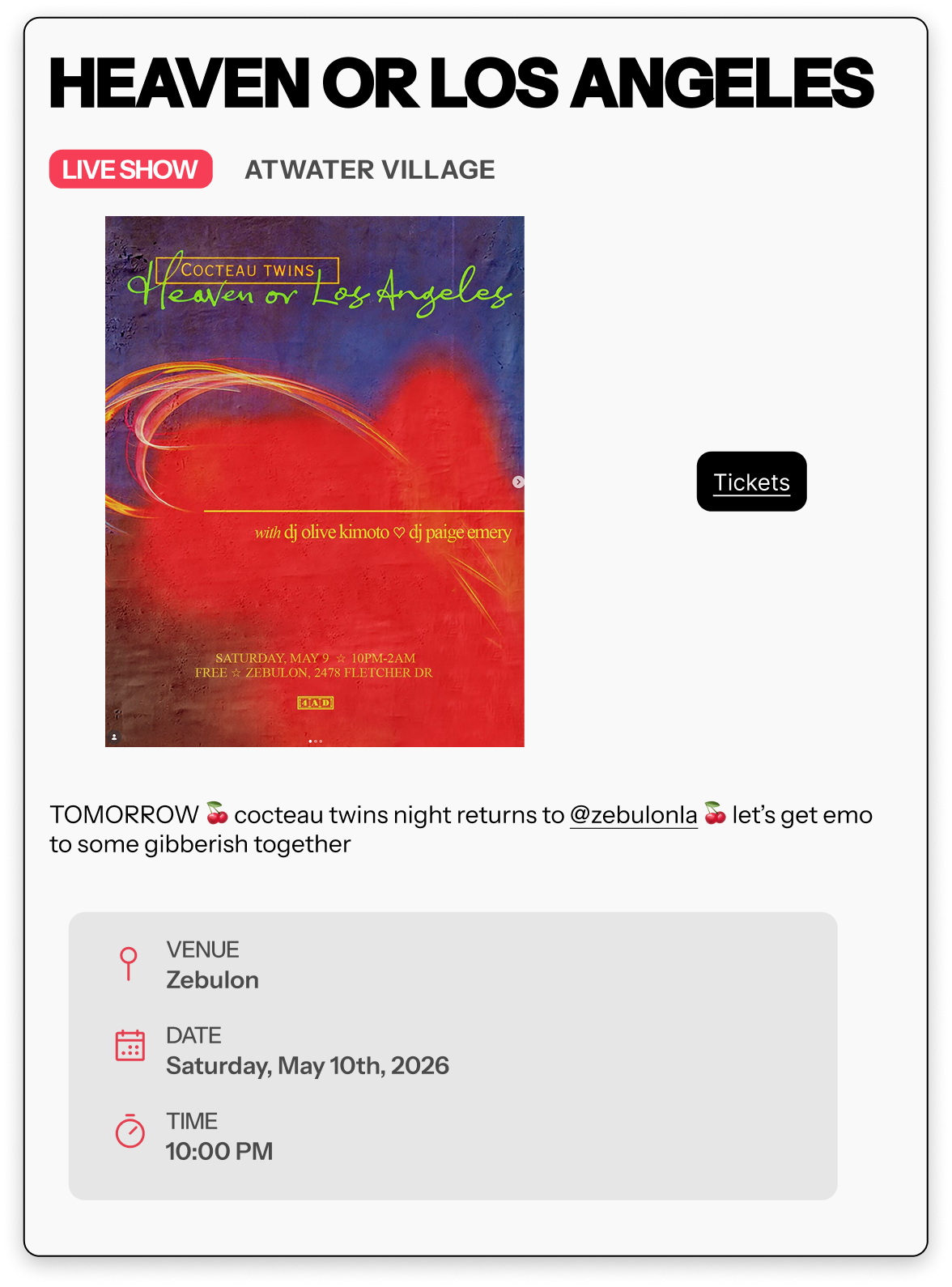
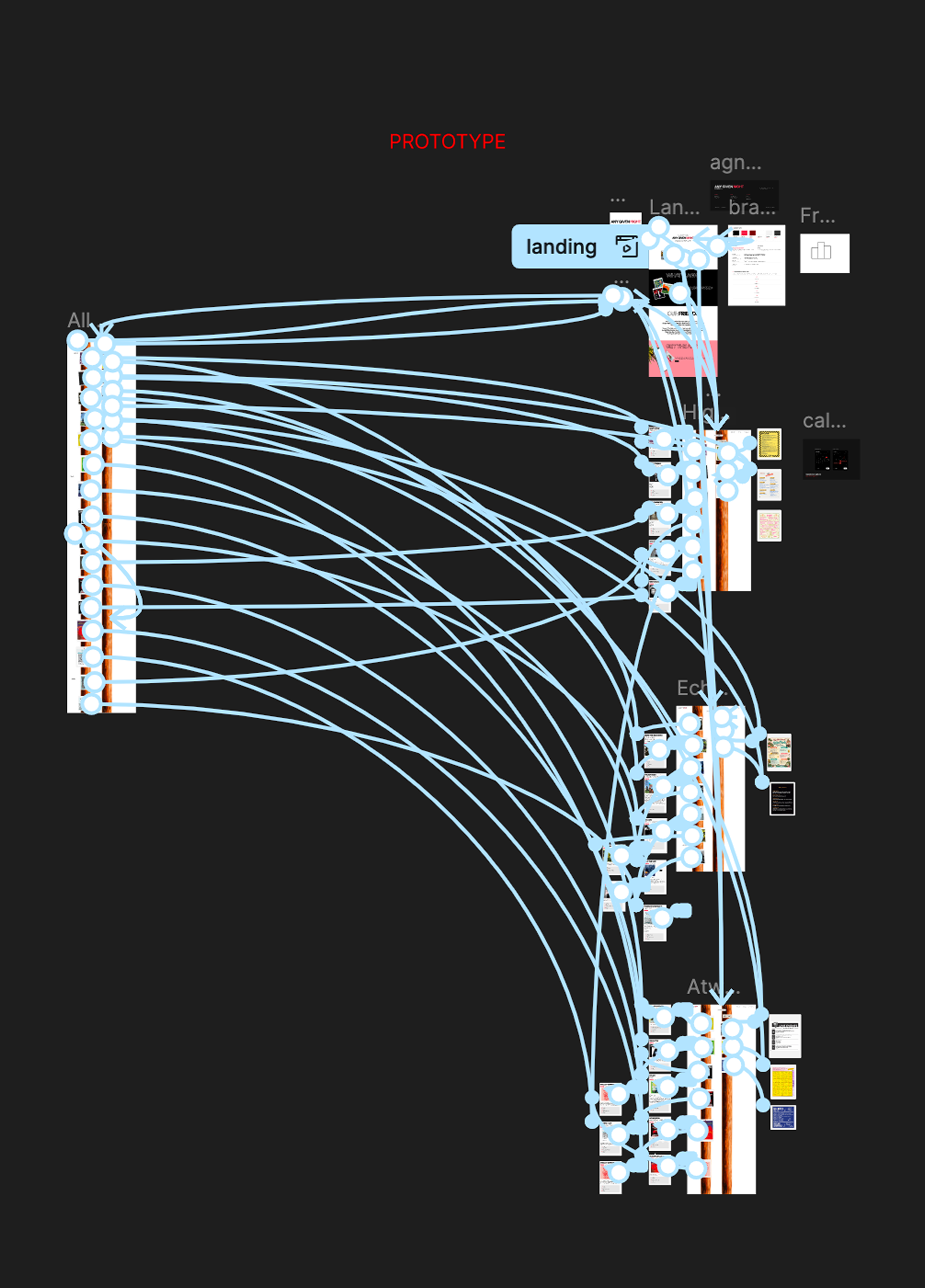
With the structure and identity settled, I built out the high-fidelity screens and an interactive Figma prototype to carry into testing.
Designing in code
The one part of the product I couldn't hand over as a static comp.
The neighborhood navigation was the product's whole thesis — the city as the interface — so I designed it and built it: an interactive three.js navigation in JavaScript, HTML, and CSS, developed in VS Code with Claude Code.
I designed this interactive Los Angeles map in Three.js, translating AWS Terrarium elevation tiles, LA building footprints, neighborhood and municipal boundary data, and custom coastline geometry into a navigable 3D landscape. I then used procedural canvas textures, custom water shaders, instanced buildings, illustrated neighborhood materials, animated coastal details, and a playful pastel palette to transform geographic data into a tactile, miniature-diorama experience — balancing real spatial context with the expressive visual identity of Any Given Night.
Designing in the medium meant motion, easing, and density were decisions I could make and test directly, rather than describe in a spec and hope survived the build.
Testing & outcomes
A remote, unmoderated study with 10 participants against the Figma prototype, fielded between 29 May and 13 June 2026.
Who I tested with
Six of the ten were already regular users of event-discovery tools — between them they named fourteen, including Dice, Resident Advisor, Eventbrite, ShowList.LA, DoLA, and Scenestar. The other four had never used one. That split was deliberate: I needed to know whether navigating by neighborhood made sense to people with no existing discovery habit, not just to the scene regulars who would forgive a rough edge.
Synthesis
I pulled 52 distinct observations out of the responses and clustered them on an affinity map into eight themes: the telephone-pole concept, poster legibility, navigation and wayfinding, neighborhood identity, calendar density, feature requests, branding and copy, and trust and curation.
What held up
The telephone-pole metaphor was the strongest signal in the study — participants called it "awesome," "strong, evocative," and a "bold, distinct visual approach," and several described browsing a neighborhood's pole as a single visual gestalt. Neighborhood-first organization held up too: one participant went straight to the neighborhood links unprompted, clicked Echo Park, scrolled the pole, and called it intuitive.
Most usefully, participants defended the poster-forward presentation against the obvious instinct to add captions to everything.
"I like that this presentation leans on the poster — it's not poster + caption, it's just… poster. After all, that is the job the poster is supposed to be able to do."
What broke
Ranked by cluster size and impact on task completion.
Posters didn't read as interactive. "It wasn't obvious that the posters were buttons" — the product's central interaction wasn't discoverable.
Poster detail was inconsistent by nature. Because the artwork is promoter-designed, some posters carried full billing and others told you nothing about who was playing.
The two-pole layout read as one system to me and as two unrelated ones to users, and their mismatched lengths made the page feel unbalanced.
There was no reliable way back. Participants couldn't tell whether they had advanced to another neighborhood or needed to backtrack.
Neighborhood names assumed local knowledge — "as a person not in LA I have no idea what neighborhoods are which" — which excludes visitors, a real share of the audience.
The date structure went unnoticed. The date rail took several scrolls to spot, ranges weren't labeled per page, and there was no way to jump ahead to a specific night.
Two participants also couldn't click the top navigation. I set that one aside rather than designing against it — it was a Figma preview limitation, and one participant confirmed the pages behaved correctly in fixed width and height mode.
By the numbers
Any Given Night launched in August 2026 at anygivennight.la.
Handoff & collaboration
Getting the design out of Figma and into a shipped product.
Developer handoff
I delivered developer-ready specs and stayed in it through implementation, working directly with [engineer] as screens moved out of Figma and into the build.
Tooling for the founding team
Aggregating listings was the team's biggest manual cost, and most event details only existed inside poster artwork. I built a venue-scouting bot on the Claude API that scrapes concert listings from venue sites and extracts event details straight out of poster images, so the founding team could keep the platform current without hand-entering every show.